Back Copy:
Anna Cayne had moved here in August, just before our sophomore year in high school, but by February she had, one by one, killed everyone in town.
Anna — who prefers to be called Anastasia — is a slightly spooky and complicated high school girl with a penchant for riddles, Houdini tricks, and ghost stories. She spends much of her time writing obituaries for every living person in town. She is unlike anyone the narrator has ever known, and they make an unlikely, though happy, pair.
Then, a week before Valentine's Day, Anna disappears, leaving behind only a dress placed neatly near a hole in the frozen river, and a string of unanswered questions. Desperate to find her, or at least to comprehend what happened and why, the narrator begins to reconstruct the past five months. And soon the fragments of curious events, intimate conversations, secrets, and peculiar letters (and the anonymous messages that continue to arrive) coalesce into haunting and surprising revelations that may implicate friends, relatives, and even Anna herself.
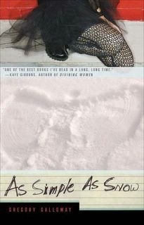
I put it on the table, I walk away, I come back and we’ve sold down again. It requires no hand-selling or selective placement on the table (some books seem to do better in the middle or in the front, its weird), and the customer never seems to need to be reassured when they come up to the counter. In fact, I’m usually the one asking the questions:
“So what made you pick this up?”
“The tights.”
Over and over again, if the customer answers at all that is what they say. The tights caught their eye and the back copy solidified the deal.
So Greg Galloway, if you are out there reading this, send your cover designer a thank you note and some flowers.
Oh, and congratulations on writing what appears to be an incredibly interesting book. We're on our third reorder and if I can keep it in stock long enough I'm going to do my best to read it.

7 comments:
I'm a "bookseller chick", too, and I'm always interested in (and sometimes frightened by)the choices people make in the books they want to read. And, while I consider myself an intelligent girl (I now have the college diploma to prove it, you know), I have never thought to ask a customer, "what made you pick this book?" I love that you ask and when I go to work this afternoon, I'm going to ask, too!
Yay! Let's hear it for another BSC!
Post your findings if you get any interesting answers. I always love to hear why people pick up certain things because the answer can be surprising (it also helps to tip you off that the book has been on TV while you are at work).
BSC, you need to go talk to Joe over at NYtimesbooks.blogspot.com -- he dissects bookcovers and I know he'd love to hear about the reactions to this!
Plus, it's a great blog...
I would also love to hear people's responses. I find it interesting how often the cover art pulls us in- and yet the writer has such little control over the cover. This one worked for me- I put it on order at my bookstore. (Okay technically it isn't MY bookstore in that I don't own it- but my purchases must surely account for some percentage.)
Don't mean to be a contrarian, but the back cover copy would put me off. But that's just me . . . sounds like I'm in the minority!
I saw this book in the bookstore today and read the first few pages - I'm not sure that the back cover copy would pull me in, but the first page DEFINITELY does. I'll be buying a copy soon.
The designer is Monica Benalcazar, and my experience with the book design was fairly painless (can't speak for Monica). i had been warned by other authors to expect little opportunity for input or feedback, and that was not the case. while i didn't work directly with Monica (most of the conversations were with my editor), I was able to offer suggestions (mostly minor) and i think that they were followed for the most part.
i must admit that it is an odd realization, knowing that someone else's efforts might/can/will have such an impact on attracting readers -- especially for a first novel -- and i know that i'm fortunate that Monica was able to capture the quality of the book in an engaging way.
as for the tights -- i do remember some conversation about them (were they more punk than goth? how would men respond to the image? should there be any person depicted on the cover at all?), but the larger issues seemd to be about how big of a departure the paperback design should be from the hardcover. i was pleased in the direction Monica went, and very pleased that readers are responding to it.
Post a Comment