I wanted a cookie when I got up this morning but I settled for a rice cake with peanut butter on it. Let me tell you, not the same. At all. Healthier, but not the same.
We had a man walk on the moon! Is it so hard then to make a rice cake taste like a cookie?
Geez.
Speaking of things that are different (but perhaps just as sweet), let’s continue our conversation about Chick-Lit while bringing in all the other examples of sub-genres that y’all feel are getting too big for their collective britches and shelf space (paranormal romance, urban fantasy, historical romance, erotic romance—poor romance!—etc). Susan Adrian had this to say about yesterday’s aforementioned glut: “I think it will turn out just fine in the end, though--like chick lit, the cream will rise to the top, and readers will still be interested in the good writers even if the genre bandwagon fails.”
An idea that I totally agree with except for the sad, but true, fact that there are some really great books out there that just don’t catch the eye of the public. How do you prove you are not like all the pink confectioned goodies out there but something new and interesting? How do you get someone to pay attention when they’ve been blinded by all those who come before?
You could have written an amazing (fill in the blank sub-genre) novel, but if the critics are just tired of reading them, if the public is just tired of the same derivative covers, if the marketing department just wasn’t on the ball, and if a bookseller didn’t read it on their off time and realize that this is obviously the hand-sell of the century, then your book could still sink away into oblivion. These days books have about six weeks to prove their worth before they’re yanked off the shelves, factor in some delayed reviews (or a lay-down date that got moved up), a slow to start word of mouth chain, and lack of up-front store time and your book could be off the shelves before anyone has realized it was there.
I could be even more depressing, but my rice cake was the cinnamon-sugar variety and I have no desire to bring about someone’s suicidal tendencies. I’m just trying to be a realist. On her blog, HelenKay asked her readers to talk about their likes and dislikes when it comes to online ads and excerpts, as well as author created doo-dads and book marks. The responses were many and varied with most people saying that they never clicked on online ads, preferred to follow reader generated feedback, and that they really liked excerpts.
Does this mean that online ads are worthless? No, setting aside the response from the small sample size, some of their comments were telling in that they said they took notice of the ads. Chances are you aren’t going to get people to click the ads themselves, but they will act as a place holder in a person’s memory. When the book is mentioned again (whether on a reader blog or in print or just seen in another ad) it will reinforce the placement. And then when they see the book in the bookstore maybe they’ll pick it up (I seem to remember three being the magic number in advertising).
What about the reader generated sales? How does one create that? Good question. I’ve seen book giveaways with the caveat that you’ll review the novel you win. I’ve seen reviewers who review rewarded with more books. I’ve seen authors who go out and search for any and all reviews to create their own review database.
But don’t you have to have some sort of buzz to get someone to be interested in the book to begin with? And what about those doo-dads that I spent so long designing? When do I give those away?
Thoughts, anyone? I suddenly realize that I need to leave for work. Look forward to reading what you come up with to finish this.
Showing posts with label Why does one book suceed and others fail. Show all posts
Showing posts with label Why does one book suceed and others fail. Show all posts
Wednesday, July 26, 2006
Tuesday, April 11, 2006
One of those big questions.
Today on Publishers Weekly's Talkback Tuesday they ask, "With The Da Vinci Code racking up big paperback sales and with the book sure to receive another boost in May with the release of the film, this week’s question is... Why has The Da Vinci Code become the bestselling novel of the century?"
In my opinion there are a number of reasons:
In my opinion there are a number of reasons:
- It's a fast, easy read with short sentences and chapters that make the plot feel like it moves quickly.
- It combined just enough fact with its fiction to make people feel like they were learning something but not in a preachy setting.
- It was freakin' everywhere, man! I remember reading that a ton of ARCs were sent out, papering most bookstores (that's how I got my copy).
- It came at a time where there was a crisis of faith in organized religion, what with all the scandal surrounding the Catholic Church.
- It, like Harry Potter, came at a time where people wanted to retreat into a fantasy, wanted to have something they could disappear into.
What are your theories?
Tuesday, January 10, 2006
Book Sense 101: Covering Covers, the Just the Facts, Ma'am Edition
Notes: This post is a continuation of my ongoing Book Sense 101 series about covers. The first post in the series is “Covering the Basics of Covers,” and the second is a Smart Bitches Day entry called, “Hit with the Pretty Stick (the “Come on Closer Remix”)”.
“Covering the Basics of Covers” is a general outline of cover basics and what works in fiction and what doesn’t. I suggest you read that before following this post (although it is not required, you’re not in school).
“Hit with the Pretty Stick” applies the same rules to upcoming romance covers. If romance isn’t your shtick, feel free to skip the post.
With that out of the way, let’s get on with the show.
When people make comparisons between fiction and nonfiction, nonfiction is inevitably characterized as the drier of the two. It’s just facts, man. And anyone who has had to sit through some boring lecture, or pour through some obscure text book, will tell you that facts can be very yawn worthy. Who could blame them with examples such as these:
Oooh, white words on a dark background, should I be sensing the dark forbidding power of the No Such Agency? The gradient thing is pretty and all, but the cover as a whole does nothing for me. The only reason I would pick up this book is if I had any interest at all in the NSA, and the part where it says “National Security Agency” is buried under the title and the author’s name. It’s reduced to third billing. Do you think reducing the NSA to third billing could be grounds for being wire-tapped? I think I’d be a bit more careful when writing about a spy agency. They might hit you with this book:
Ack! Gah! Word blindness. Focusing on the white. Then the black. Oy, so dizzy. What was this about again? The KGB? The red on the black background fades in, but maybe that’s my picture quality. Is that what that symbol means? KGB? As far as a cover goes it leaves me with a lot of questions, but it doesn’t do anything to attract me beyond my own interest in the KGB. Combine that with the fact that this book is mammoth and hardbound, and I’ll be waiting for the paperback edition, thank you very much.
These books, with their uninspiring covers, do nothing to relieve the idea that history/current events/etc are only for the person looking for hard, dense literature because they make no attempt to appeal to an audience outside of their built in niche. Now I find this idea insulting to not only my intelligence but also to everyone out there who will read whatever catches their eye.
Of course, this is partially a result of my education and I must remind myself that not everyone had a professor who seemed to be a blend of Robin Williams, Chris Farley, and an auctioneer on crack to teach them the finer points of the history of Biology and Western Medicine. They missed out on writing notes so fast that they had to form a tag-team with the people on either side of them, having said professor play Blue Oyster Cult’s “Don’t Fear the Reaper” to herald the midterm, enjoying the creme brulèe recipe that he learned from Julia Childs (actually learned from her, not a cook book), and scribbling furiously on the final while he sipped eighteen-year-old scotch.
Good times. Good times.
Was this an arcane from of liberal arts torture? Perhaps.
Did he blind me with science, brainwash me with history? Could be.
Could said “blindness” be why I find nonfiction so interesting and want others to share my obsession? Hell no.
From this professor I learned that history could be entertaining and easily accessible, sure, but I learned the same thing from Harrison Ford as Indiana Jones (and let’s just take moment to remember Harrison as Indy. Ah Indy, much love). History is amazing, and it belongs to everyone so everyone should have some knowledge of it!
Alright, enough of my soapbox. All I’m saying is just because you don’t go looking for it doesn’t mean that you won’t be interested in a subject once you stumble across it, and publishers believe that too. Check out this cover for The Great Mortality:
While this cover shares a bit of the writing overload that affects The World Was Going Our Way , it tempers it in a couple of different ways. The inclusion (and twisting) of the painting, Woman and Death, by Hans Baldung Grien on the cover, ties in the tattered parchment look of the white backdrop to the title. This is a history of the plague of the 1300s (not to be confused with any of the other plagues, and yes there were others), and we’d have a sense of that even if we never saw the words “Black Death” and “Plague” in the subtitle.
Would this book (now in paperback) appeal to the same people who bought Geraldine Brooks’ Year of Wonders? Maybe, maybe not. That’s about a different plague entirely.
Would this book appeal to someone who was just browsing through the section without any idea of what they were looking for? I’ve seen it happen time and again, and I think it owes it all to the cover.
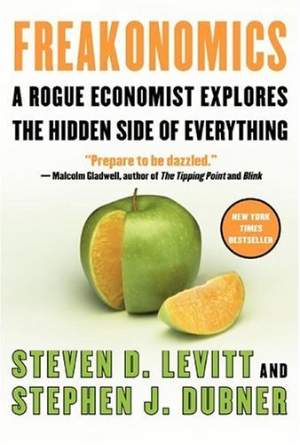
The publishing industry, in an attempt to drive up sales, has decided to embrace this idea of selling outside the box (via these new and attention-catching covers) across the spectrum of nonfiction. What else could explain the cover for Freakonomics?
The use of neon green and orange on the white background is very eye-catching and then they further up the ante by playing the visual trick with the apple. See, it’s an apple with an orange middle. It’s all apples and oranges, but not, because they’re the same even though their different… get it? Get it?
Er, anyway, then you have the large blurb by Malcolm Gladwell. Gladwell and Levitt/Dubner became tied together after a debate in New York about the drop in crime. I can’t find the link to the article (if you have a subscription to the New York Times you can look it up), but the debate basically ended with Gladwell saying something like “This is normally where I would have a rebuttal, but I agree with what you’re saying.” Suddenly Freakonomics and the Tipping Point (Gladwell’s book) were irrevocably joined. Talk about a snazzy piece of marketing and piggybacking, but I’ll cover those two issues in a later column.
The cover of Stiff: the Curious Lives of Human Cadavers, by Mary Roach, shows an example of the same playfulness with the subject matter exhibited in Freakonomics, albeit in a more morbid way.
The greens provide an alien antiseptic feel, the feet with the toe-tag screams body, and the title—off-kilter as if written on the toe-tag—captures the morbid sense of humor. The cover, like that of Freakonomics, manages to portray the tone and subject matter of the book in the best way possible. A true bravo moment given that this is a book about dead bodies (one I highly recommend to anyone who has a keen sense of the absurd).
“Okay,” says you, “I get that they can make Freaky economics interesting looking, and I’m sure cadaver lovers fall in the same category, but what about something normal? Can they do something to that?”
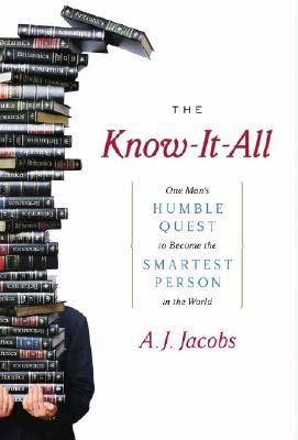
Well, that depends if you think that the cover for Know-It-All: One Man’s Humble Plot to Become the Smartest Person in the World works or not.
Personally I think it does, and my customers seem to agree as this is one of the bestsellers off my trade paperback table. It’s got some great things working for it from the title (hello, hyperbole—smartest man in the world—plus false modesty—humble quest—equals this guy either has a real tongue-and-cheek sense of humor or he’s an ass, and ass’s only get their blogs published), to the picture that follows the sight-line down the title, and the books falling from the top of the stack, which tells us he might not have succeeded in his effort. The whole presentation is clean against its white backdrop and despite its “grandiose” claims, lacking in too many embellishments. I truly hope that the book can live up to the promise of the cover (it’s in my TBR pile).
“Okay, so history books, economics books—when they are about freaky things—can have interesting covers, science books about cadavers, and biographies can have interesting covers, but they’re about interesting things—if you’re a sick freak, which obviously you are. What about business books, huh? Have you seen the cover for The 48 Laws of Power?”
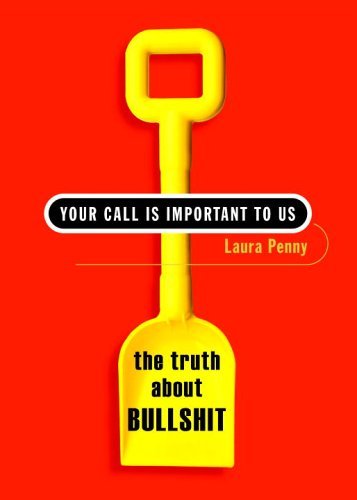
God yes, and it’s so bloody ugly. I hate shelving that book, I really do. And despite it’s bold use of orangey-red and blue I’ve developed some sort of book blindness to seeing it, which may or may not be caused by my hatred for that cover. Business books as a whole tend to be a bit blah. Every once in a while you get chairs on the beach (a la David Bach), which just screams retirement-let-me-show-you-what-to-do-with-your-money, or a marketing book like The Deviant’s Advantage, but as a whole, for a area of books that want to make money off of teaching other people how to make money, they don’t try to hard. This makes the ones who do stand out better. Take, for example, Laura Penny’s, Your Call is Important to Us.
From a distance you get smacked in the face by the bold combination of yellow and red. Yellow and red, by the way, are the two most eye-catching colors (think about that next time you are in Micky D’s), combined it’s almost retinal overload, but it gets your attention. Once you get closer, the use of white draws your eyes to the main title, even though it is smaller than the subtitle, and then your eyes follow the handle of the shovel down to—POW—the word Bullshit. Want to get someone’s attention in the United States? Put a pejorative word in your title. Works every time. Just make sure you’ve got something to back it up. In this case Penny does. Despite using some great marketing techniques to grab your attention, her book is about how marketing and the customer service industry screw with your head. Oh, and she says bullshit a lot.
Anyone want to guess why they chose to put a shovel on the cover? I think it’s pretty clear.
Is this the most attractive cover I’ve seen? Well, if your using the word attractive to ask whether or not I think this cover is pretty, then the answer is no. I do not think this cover is pretty, it does, however do the job.
To recap: A cover can be butt ugly if that works with the marketing strategy to get customers’ attention, which has evolved to be the sole purpose the dust jacket/cover in this bookselling age. Fiction, nonfiction, or strange hybrids in between, the point of the cover is to get the attention of the shopper who may not even be looking for this book. A pretty cover, if it can’t differentiate itself from the crowd, can be just as much as a detriment as a boring cover, so start praying to the Tiki Gods for your (if you’re an author) design department to choose, and choose wisely because you want to hook all the browsers you can.
Getting people to actually go out looking for the book is the role of marketing and publicity departments, and most importantly the author, but that’s the subject for my next column (which will hopefully appear in the next couple of days, I’m following a closing shift with an opening one, so no promises).
“Covering the Basics of Covers” is a general outline of cover basics and what works in fiction and what doesn’t. I suggest you read that before following this post (although it is not required, you’re not in school).
“Hit with the Pretty Stick” applies the same rules to upcoming romance covers. If romance isn’t your shtick, feel free to skip the post.
With that out of the way, let’s get on with the show.
When people make comparisons between fiction and nonfiction, nonfiction is inevitably characterized as the drier of the two. It’s just facts, man. And anyone who has had to sit through some boring lecture, or pour through some obscure text book, will tell you that facts can be very yawn worthy. Who could blame them with examples such as these:

Oooh, white words on a dark background, should I be sensing the dark forbidding power of the No Such Agency? The gradient thing is pretty and all, but the cover as a whole does nothing for me. The only reason I would pick up this book is if I had any interest at all in the NSA, and the part where it says “National Security Agency” is buried under the title and the author’s name. It’s reduced to third billing. Do you think reducing the NSA to third billing could be grounds for being wire-tapped? I think I’d be a bit more careful when writing about a spy agency. They might hit you with this book:

Ack! Gah! Word blindness. Focusing on the white. Then the black. Oy, so dizzy. What was this about again? The KGB? The red on the black background fades in, but maybe that’s my picture quality. Is that what that symbol means? KGB? As far as a cover goes it leaves me with a lot of questions, but it doesn’t do anything to attract me beyond my own interest in the KGB. Combine that with the fact that this book is mammoth and hardbound, and I’ll be waiting for the paperback edition, thank you very much.
These books, with their uninspiring covers, do nothing to relieve the idea that history/current events/etc are only for the person looking for hard, dense literature because they make no attempt to appeal to an audience outside of their built in niche. Now I find this idea insulting to not only my intelligence but also to everyone out there who will read whatever catches their eye.
Of course, this is partially a result of my education and I must remind myself that not everyone had a professor who seemed to be a blend of Robin Williams, Chris Farley, and an auctioneer on crack to teach them the finer points of the history of Biology and Western Medicine. They missed out on writing notes so fast that they had to form a tag-team with the people on either side of them, having said professor play Blue Oyster Cult’s “Don’t Fear the Reaper” to herald the midterm, enjoying the creme brulèe recipe that he learned from Julia Childs (actually learned from her, not a cook book), and scribbling furiously on the final while he sipped eighteen-year-old scotch.
Good times. Good times.
Was this an arcane from of liberal arts torture? Perhaps.
Did he blind me with science, brainwash me with history? Could be.
Could said “blindness” be why I find nonfiction so interesting and want others to share my obsession? Hell no.
From this professor I learned that history could be entertaining and easily accessible, sure, but I learned the same thing from Harrison Ford as Indiana Jones (and let’s just take moment to remember Harrison as Indy. Ah Indy, much love). History is amazing, and it belongs to everyone so everyone should have some knowledge of it!
Alright, enough of my soapbox. All I’m saying is just because you don’t go looking for it doesn’t mean that you won’t be interested in a subject once you stumble across it, and publishers believe that too. Check out this cover for The Great Mortality:

While this cover shares a bit of the writing overload that affects The World Was Going Our Way , it tempers it in a couple of different ways. The inclusion (and twisting) of the painting, Woman and Death, by Hans Baldung Grien on the cover, ties in the tattered parchment look of the white backdrop to the title. This is a history of the plague of the 1300s (not to be confused with any of the other plagues, and yes there were others), and we’d have a sense of that even if we never saw the words “Black Death” and “Plague” in the subtitle.
Would this book (now in paperback) appeal to the same people who bought Geraldine Brooks’ Year of Wonders? Maybe, maybe not. That’s about a different plague entirely.
Would this book appeal to someone who was just browsing through the section without any idea of what they were looking for? I’ve seen it happen time and again, and I think it owes it all to the cover.
The publishing industry, in an attempt to drive up sales, has decided to embrace this idea of selling outside the box (via these new and attention-catching covers) across the spectrum of nonfiction. What else could explain the cover for Freakonomics?
The use of neon green and orange on the white background is very eye-catching and then they further up the ante by playing the visual trick with the apple. See, it’s an apple with an orange middle. It’s all apples and oranges, but not, because they’re the same even though their different… get it? Get it?
Er, anyway, then you have the large blurb by Malcolm Gladwell. Gladwell and Levitt/Dubner became tied together after a debate in New York about the drop in crime. I can’t find the link to the article (if you have a subscription to the New York Times you can look it up), but the debate basically ended with Gladwell saying something like “This is normally where I would have a rebuttal, but I agree with what you’re saying.” Suddenly Freakonomics and the Tipping Point (Gladwell’s book) were irrevocably joined. Talk about a snazzy piece of marketing and piggybacking, but I’ll cover those two issues in a later column.
The cover of Stiff: the Curious Lives of Human Cadavers, by Mary Roach, shows an example of the same playfulness with the subject matter exhibited in Freakonomics, albeit in a more morbid way.

The greens provide an alien antiseptic feel, the feet with the toe-tag screams body, and the title—off-kilter as if written on the toe-tag—captures the morbid sense of humor. The cover, like that of Freakonomics, manages to portray the tone and subject matter of the book in the best way possible. A true bravo moment given that this is a book about dead bodies (one I highly recommend to anyone who has a keen sense of the absurd).
“Okay,” says you, “I get that they can make Freaky economics interesting looking, and I’m sure cadaver lovers fall in the same category, but what about something normal? Can they do something to that?”
Well, that depends if you think that the cover for Know-It-All: One Man’s Humble Plot to Become the Smartest Person in the World works or not.
Personally I think it does, and my customers seem to agree as this is one of the bestsellers off my trade paperback table. It’s got some great things working for it from the title (hello, hyperbole—smartest man in the world—plus false modesty—humble quest—equals this guy either has a real tongue-and-cheek sense of humor or he’s an ass, and ass’s only get their blogs published), to the picture that follows the sight-line down the title, and the books falling from the top of the stack, which tells us he might not have succeeded in his effort. The whole presentation is clean against its white backdrop and despite its “grandiose” claims, lacking in too many embellishments. I truly hope that the book can live up to the promise of the cover (it’s in my TBR pile).
“Okay, so history books, economics books—when they are about freaky things—can have interesting covers, science books about cadavers, and biographies can have interesting covers, but they’re about interesting things—if you’re a sick freak, which obviously you are. What about business books, huh? Have you seen the cover for The 48 Laws of Power?”
God yes, and it’s so bloody ugly. I hate shelving that book, I really do. And despite it’s bold use of orangey-red and blue I’ve developed some sort of book blindness to seeing it, which may or may not be caused by my hatred for that cover. Business books as a whole tend to be a bit blah. Every once in a while you get chairs on the beach (a la David Bach), which just screams retirement-let-me-show-you-what-to-do-with-your-money, or a marketing book like The Deviant’s Advantage, but as a whole, for a area of books that want to make money off of teaching other people how to make money, they don’t try to hard. This makes the ones who do stand out better. Take, for example, Laura Penny’s, Your Call is Important to Us.
From a distance you get smacked in the face by the bold combination of yellow and red. Yellow and red, by the way, are the two most eye-catching colors (think about that next time you are in Micky D’s), combined it’s almost retinal overload, but it gets your attention. Once you get closer, the use of white draws your eyes to the main title, even though it is smaller than the subtitle, and then your eyes follow the handle of the shovel down to—POW—the word Bullshit. Want to get someone’s attention in the United States? Put a pejorative word in your title. Works every time. Just make sure you’ve got something to back it up. In this case Penny does. Despite using some great marketing techniques to grab your attention, her book is about how marketing and the customer service industry screw with your head. Oh, and she says bullshit a lot.
Anyone want to guess why they chose to put a shovel on the cover? I think it’s pretty clear.
Is this the most attractive cover I’ve seen? Well, if your using the word attractive to ask whether or not I think this cover is pretty, then the answer is no. I do not think this cover is pretty, it does, however do the job.
To recap: A cover can be butt ugly if that works with the marketing strategy to get customers’ attention, which has evolved to be the sole purpose the dust jacket/cover in this bookselling age. Fiction, nonfiction, or strange hybrids in between, the point of the cover is to get the attention of the shopper who may not even be looking for this book. A pretty cover, if it can’t differentiate itself from the crowd, can be just as much as a detriment as a boring cover, so start praying to the Tiki Gods for your (if you’re an author) design department to choose, and choose wisely because you want to hook all the browsers you can.
Getting people to actually go out looking for the book is the role of marketing and publicity departments, and most importantly the author, but that’s the subject for my next column (which will hopefully appear in the next couple of days, I’m following a closing shift with an opening one, so no promises).
Sunday, January 08, 2006
Book Sense 101: Covering the Basics of Covers*
*In response to "Food Coma induced ponderings and questions" and questions asked on "Give'em the hook."
I would like to start this essay with a disclaimer:
I am not an expert. I do not have a degree in bookselling, I’ve never been a book buyer for a national chain and I’ve never worked for a publishing company. All of my thoughts and opinions are based on what I’ve learned in the five years I’ve been selling books. What my customers buy does not necessarily represent the whole of the United States or even the whole of my state, nor should it. Geographically barriers breed distinctions; that’s the basis for evolution my biology professors always used to say and it’s the basis for book buying too. Just because my customers love a certain title doesn’t mean that the good folks of Tuscaloosa, Alabama are going to greet it with the same enthusiasm. On a more local level, what people buy in an urban store (my designation) vs. a suburban store will also vary wildly. Comfort levels and convenience factor in to a high degree.
What I can promise is this:
Having worked in both suburban and urban areas on the West Coast, and having made it my business to stop into every bookstore I’ve ever come across on my travels, I can provide you with my opinion of what works at the store level and what doesn’t. The few (read: very few) classes I’ve taken in book design and publishing have helped shape these opinions, although I’m sure that someone who’s been in the book business could give you the charts, graphs and marketing breakdowns that I cannot. What I can provide you with is an in-depth study of what my customers buy, and what my observations (and their comments) have told me about their buying habits.
If this helps you as an author to focus your audience, then great; I’m glad I could be of service. If this helps you as a reader to pin down finally what attracts you to books, then I’m glad that I could help explain that “I know what I like” feeling. If you read this all and come to the conclusion that I’m full of shit, well, I’ve been told that before. There is a reason why the initials of bookseller are synonymous with those for bullshit, and I am in the business of selling people stuff they don’t need.
That said, if you want to check out two great books on the book business as a whole (by people who have much better credentials than I, but with whom I agree), I would suggest reading Jason Epstein’s, Book Business: Publishing Past, Present and Future, and André Schiffrin’s, The Business of Books.
Now that we’ve gotten my credentials and disclaimers out of the way (I’m also not responsible for any lost or stolen objects while you read this post), let’s focus on book covers. Primarily I’m going to focus on book covers in their trade paperback form for books that have sold well off my front table, although I will also hit upon some hard bound books that did (or didn’t do well) with their front of store exposure. While some have now gone on to be bestsellers, when the boss and I picked these titles (we don’t follow any company provided planogram for the two areas of focus) they were either fresh titles or titles that had yet to receive a lot of press (this does not mean that they hadn’t already been well reviewed, but that’s a section of this essay meant for a later day). For display purposes these books are placed on the table face up in pyramid stacks, so the first thing a browsing customer would see upon entering our store is the cover.
I must make one thing clear right now: books are almost always judged on their cover alone by a browsing customer, and this is the customer to whom all books want to appeal. I’m not saying an awful cover cannot be overcome with great press and reviews, or that a gorgeous cover equals high sales. As your mother always said, it is what is inside that counts in the end, and in the case of books causes the word of mouth recommendations that bring in more people for your title. But the average browser makes the choice to buy a book within the first seven seconds of picking up. In seven seconds the customer has barely had time to flip the book over and peruse the back copy.
Don’t believe me? Test this the next time you are out book shopping.
Finished? Before you flip that book over look at your watch again and see how much time has elapsed. Probably a lot more than seven seconds.
A successful book cover must:
We no longer live in a time where only a small number of books come out every season, instead we’re bombarded by thousands of new titles every year, with 25,184 new fiction titles being released in 2004 alone (around 195,000 new titles in total book production) (Publisher’s Weekly, Cranking It Out 5/3/05). Book covers have attempted to evolve using the latest marketing techniques to catch the browsers eye and hook them into picking up the book. Somewhere in a publishing company far away there is a marketing team attempting with the same precision of Swiss watchmakers to find the perfect hook to attract the target audience. This immediate hook is most often achieved through the cover art and the overall appearance of the book. It is then up to additional hooks of the title, author’s name, and blurb to keep that book in the customers hand during those crucial seven seconds. If the customer gets past the cover to the back copy you’ve almost guaranteed a sale.
For our first example, let’s look at The Illuminator by Brenda Rickman Vantrease:
Since I placed this title on our table a week ago, we’ve sold out and had to reorder our copies from a local distributor. From a distance the first thing that you see when looking at this cover is the gorgeous artwork and the touch of gilt foil to highlight. This is a great improvement over the old cover (which is what you will see if you click the link above), which was much too busy in my opinion. Upon closer examination, you then take in the title (above which the book informs us it was a “National Bestseller”) and the author. Your eyes are then drawn to the very incongruous looking blue box in the lower right hand corner that informs you that this is a Reading Group friendly book. In the age of the book club tyranny (and yes, I too belong to a book club), this is very, very important. After taking all of these other elements in, the average browser only then gets to the nice blurb from the Boston Globe that proclaims this book to be “a sweeping portrayal of the distant past…ample in romance, mystery, and adventure.”
My, oh my, how can you resist that?
“I’m not into historicals,” you might say.
Or, “I’m a guy. What do I want with romance in my books?”
Well, obviously this book is not attempting grab the postmodernists or the Clive Cussler crowd (although Clive’s guys do get their share of the ladies). It’s aiming for the group of readers out there who picked up Philippa Gregory’s The Other Boleyn Girl or Umberto Eco’s Baudolino, and it has been selling well in this trade form to women and men. Sure some may remember it from the press junket a year or two ago, but the majority of my customers who pick it up off the table do so because something about it appeals to them: the cover.
A couple of years ago we ordered in Across the Nightingale Floor by Lian Hearn because we liked the cover, and the trend at the time seemed to be a great love of all things Middle Eastern (see: Kite Runner) and Asiatic in general (see: Memoirs of a Geisha) at our store. We didn’t really know anything about it—not that it was an International Bestseller (as the cover claims) or that it would soon become a New York Times Notable Book (an emblem you can find on later copies)—just that it was keeping with a trend and sounded interesting.
Within a week all six copies we’d placed on the table were gone (which is fast for my tiny store), so we ordered in six more…and then six more…and then the next book in the series (and six more of the first book because we were out again). We couldn’t believe it, and we couldn’t get customers to explain why they picked up the book to begin with (“It sounded interesting,” I got time and again). God forbid that you ask when they came back for the second book because they’d look at you like you were an idiot. “Don’t you know? It’s on your table. You mean you haven’t read it yet?”
We started watching the customers shop the table and what we saw was fascinating. What the boss and I viewed as a reasonably attractive cover (although nothing to write home about) had the power to keep drawing the customers gaze. Did they approach the table for that first book? No, not unless someone specifically sent them in for it. But as they looked at all the different covers on the table that was the one they kept going back to time and again. Soon they were picking it up, and the next thing you knew they were buying it. I finally checked out a copy myself just to see what all the fuss was about and was surprised how much I enjoyed the series. To this day it is one of my favorite recommendations, and it continues to draw people with all different genre loves from fantasy to straight historical fiction.
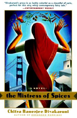
Another book we ordered in because of the Middle Eastern trend was The Mistress of Spices by Chitra Banerjee Divakaruni.
Divakaruni is a pretty well known writer of India-themed stories, poetry and short stories. Her fame is reflected in the fact that her name is only slightly smaller than the title (in this later printing, this was actually her first book). If you ever want to know how much a marketing department thinks about the selling power of an author’s name look at its placement and prominence on the cover. Patterson, Grisham, Roberts, Martin and others have names that often are larger than the titles themselves. Divakaruni might not be an automatic bestseller, but as a fiction writer she does pretty well. The Mistress of Spices cover is bright (reflecting the culture it stems from), the cover art hints at the “magical realism” techniques incorporated throughout the story, and overall appearance appeals to the feminine reader (who is targeted with most of Divakaruni’s work).
This cover is a bit of a cross-subgenre hybrid; meant to appeal to the female reader that wants something different but not Chick-Lit, and the Chick-Lit reader who wants a little lyricism and culture (this cover was changed before Chick-Lit started its venture into the Bollywood-esque lives of Indian women). I’m interested to see what they’ll do to the cover if the movie based on the book (which has already premiered at the Toronto Film Festival) is released here in the United States.
For the final cover today, let’s look at Marie Bostwick’s book, Fields of Gold.
Unlike many books these days, Fields of Gold was released directly to trade. The water color quality of the cover (done in soft purples) and the quote from Gaffney makes it clear that this title is focused towards the Women’s Fiction audience and not the sharper edged Chick-Lit crowd. The old-fashioned plane in the distance tells us (the viewer) that the book does not take place in the present. The reason why I chose this book as an example is because unlike the other books it does not hit all the points of a successful cover and it shows in the sales.
Is the cover an accurate representation of the concept of the book? Quite well.
Does it appeal to its target audience? Yes.
Does the cover catch the eye and make the book standout when placed with a group of other titles? Not exactly.
I’ve noticed a curious thing when it comes to this title; it has a tendency to blend in when placed with other books on the wall display bays. When the author visited several months ago we placed her book on the table, and there it sold out in a couple of weeks. While in the process of reordering the title, we changed the table around and there was no longer an open space for it, so we stuck it in a wall bay. The book was still presented to the customer face out, but instead of lying on its back on a table, the book was now about chest level and facing out from a wall. In its new home, despite from of store marketing, it has barely moved at all.
I propose that this has nothing to do with content and everything to do with the softness of the cover. On the table the stack’s height help differentiate it from the titles around it, whereas on the wall depth perception is inhibited, and customers begin to suffer from what I call book blindness. When people just look at the wall (with its massive amount of titles and gray backdrop) without focusing on any one point, the covers blur together into one giant mass. Covers that are bright or edgy manage to “pop” despite this, and become points of reference, but the softer covers blend into the background. Alice Sebold’s Lovely Bones suffers from the same problem, and it’s only the well known story (and book clubs) that keeps people coming in for it. Even then they ask us to find it for them.
That’s all the covers I have the energy for today, I hope this has been helpful. Tomorrow I’ll hit some more genre specific covers (romance for smart bitches and such), and then we’ll move on to nonfiction (a.k.a. that thing that sold so well over Christmas) and hardcovers. After I be all I can be with the covers, I’ll go on to hit the marketing aspect of books, such as TV appearances, book clubs, and why you should worship at the Cult of Oprah (or not). If you have anything else you want me to add (or explain) as I go along, please let me know.
I would like to start this essay with a disclaimer:
I am not an expert. I do not have a degree in bookselling, I’ve never been a book buyer for a national chain and I’ve never worked for a publishing company. All of my thoughts and opinions are based on what I’ve learned in the five years I’ve been selling books. What my customers buy does not necessarily represent the whole of the United States or even the whole of my state, nor should it. Geographically barriers breed distinctions; that’s the basis for evolution my biology professors always used to say and it’s the basis for book buying too. Just because my customers love a certain title doesn’t mean that the good folks of Tuscaloosa, Alabama are going to greet it with the same enthusiasm. On a more local level, what people buy in an urban store (my designation) vs. a suburban store will also vary wildly. Comfort levels and convenience factor in to a high degree.
What I can promise is this:
Having worked in both suburban and urban areas on the West Coast, and having made it my business to stop into every bookstore I’ve ever come across on my travels, I can provide you with my opinion of what works at the store level and what doesn’t. The few (read: very few) classes I’ve taken in book design and publishing have helped shape these opinions, although I’m sure that someone who’s been in the book business could give you the charts, graphs and marketing breakdowns that I cannot. What I can provide you with is an in-depth study of what my customers buy, and what my observations (and their comments) have told me about their buying habits.
If this helps you as an author to focus your audience, then great; I’m glad I could be of service. If this helps you as a reader to pin down finally what attracts you to books, then I’m glad that I could help explain that “I know what I like” feeling. If you read this all and come to the conclusion that I’m full of shit, well, I’ve been told that before. There is a reason why the initials of bookseller are synonymous with those for bullshit, and I am in the business of selling people stuff they don’t need.
That said, if you want to check out two great books on the book business as a whole (by people who have much better credentials than I, but with whom I agree), I would suggest reading Jason Epstein’s, Book Business: Publishing Past, Present and Future, and André Schiffrin’s, The Business of Books.
Now that we’ve gotten my credentials and disclaimers out of the way (I’m also not responsible for any lost or stolen objects while you read this post), let’s focus on book covers. Primarily I’m going to focus on book covers in their trade paperback form for books that have sold well off my front table, although I will also hit upon some hard bound books that did (or didn’t do well) with their front of store exposure. While some have now gone on to be bestsellers, when the boss and I picked these titles (we don’t follow any company provided planogram for the two areas of focus) they were either fresh titles or titles that had yet to receive a lot of press (this does not mean that they hadn’t already been well reviewed, but that’s a section of this essay meant for a later day). For display purposes these books are placed on the table face up in pyramid stacks, so the first thing a browsing customer would see upon entering our store is the cover.
I must make one thing clear right now: books are almost always judged on their cover alone by a browsing customer, and this is the customer to whom all books want to appeal. I’m not saying an awful cover cannot be overcome with great press and reviews, or that a gorgeous cover equals high sales. As your mother always said, it is what is inside that counts in the end, and in the case of books causes the word of mouth recommendations that bring in more people for your title. But the average browser makes the choice to buy a book within the first seven seconds of picking up. In seven seconds the customer has barely had time to flip the book over and peruse the back copy.
Don’t believe me? Test this the next time you are out book shopping.
- Go to your bookstore.
- Pick up the first book that catches your eye.
- Now look at the seconds hand on your watch, and remember the time.
- Read and look at everything you usually read and look at on the cover.
Finished? Before you flip that book over look at your watch again and see how much time has elapsed. Probably a lot more than seven seconds.
A successful book cover must:
- Catch the eye
- Appeal to the target audience
- Represent the book in some way (plot, theme, character, or setting)
- Stand out when placed with other books
We no longer live in a time where only a small number of books come out every season, instead we’re bombarded by thousands of new titles every year, with 25,184 new fiction titles being released in 2004 alone (around 195,000 new titles in total book production) (Publisher’s Weekly, Cranking It Out 5/3/05). Book covers have attempted to evolve using the latest marketing techniques to catch the browsers eye and hook them into picking up the book. Somewhere in a publishing company far away there is a marketing team attempting with the same precision of Swiss watchmakers to find the perfect hook to attract the target audience. This immediate hook is most often achieved through the cover art and the overall appearance of the book. It is then up to additional hooks of the title, author’s name, and blurb to keep that book in the customers hand during those crucial seven seconds. If the customer gets past the cover to the back copy you’ve almost guaranteed a sale.
For our first example, let’s look at The Illuminator by Brenda Rickman Vantrease:

Since I placed this title on our table a week ago, we’ve sold out and had to reorder our copies from a local distributor. From a distance the first thing that you see when looking at this cover is the gorgeous artwork and the touch of gilt foil to highlight. This is a great improvement over the old cover (which is what you will see if you click the link above), which was much too busy in my opinion. Upon closer examination, you then take in the title (above which the book informs us it was a “National Bestseller”) and the author. Your eyes are then drawn to the very incongruous looking blue box in the lower right hand corner that informs you that this is a Reading Group friendly book. In the age of the book club tyranny (and yes, I too belong to a book club), this is very, very important. After taking all of these other elements in, the average browser only then gets to the nice blurb from the Boston Globe that proclaims this book to be “a sweeping portrayal of the distant past…ample in romance, mystery, and adventure.”
My, oh my, how can you resist that?
“I’m not into historicals,” you might say.
Or, “I’m a guy. What do I want with romance in my books?”
Well, obviously this book is not attempting grab the postmodernists or the Clive Cussler crowd (although Clive’s guys do get their share of the ladies). It’s aiming for the group of readers out there who picked up Philippa Gregory’s The Other Boleyn Girl or Umberto Eco’s Baudolino, and it has been selling well in this trade form to women and men. Sure some may remember it from the press junket a year or two ago, but the majority of my customers who pick it up off the table do so because something about it appeals to them: the cover.
A couple of years ago we ordered in Across the Nightingale Floor by Lian Hearn because we liked the cover, and the trend at the time seemed to be a great love of all things Middle Eastern (see: Kite Runner) and Asiatic in general (see: Memoirs of a Geisha) at our store. We didn’t really know anything about it—not that it was an International Bestseller (as the cover claims) or that it would soon become a New York Times Notable Book (an emblem you can find on later copies)—just that it was keeping with a trend and sounded interesting.

Within a week all six copies we’d placed on the table were gone (which is fast for my tiny store), so we ordered in six more…and then six more…and then the next book in the series (and six more of the first book because we were out again). We couldn’t believe it, and we couldn’t get customers to explain why they picked up the book to begin with (“It sounded interesting,” I got time and again). God forbid that you ask when they came back for the second book because they’d look at you like you were an idiot. “Don’t you know? It’s on your table. You mean you haven’t read it yet?”
We started watching the customers shop the table and what we saw was fascinating. What the boss and I viewed as a reasonably attractive cover (although nothing to write home about) had the power to keep drawing the customers gaze. Did they approach the table for that first book? No, not unless someone specifically sent them in for it. But as they looked at all the different covers on the table that was the one they kept going back to time and again. Soon they were picking it up, and the next thing you knew they were buying it. I finally checked out a copy myself just to see what all the fuss was about and was surprised how much I enjoyed the series. To this day it is one of my favorite recommendations, and it continues to draw people with all different genre loves from fantasy to straight historical fiction.
Another book we ordered in because of the Middle Eastern trend was The Mistress of Spices by Chitra Banerjee Divakaruni.
Divakaruni is a pretty well known writer of India-themed stories, poetry and short stories. Her fame is reflected in the fact that her name is only slightly smaller than the title (in this later printing, this was actually her first book). If you ever want to know how much a marketing department thinks about the selling power of an author’s name look at its placement and prominence on the cover. Patterson, Grisham, Roberts, Martin and others have names that often are larger than the titles themselves. Divakaruni might not be an automatic bestseller, but as a fiction writer she does pretty well. The Mistress of Spices cover is bright (reflecting the culture it stems from), the cover art hints at the “magical realism” techniques incorporated throughout the story, and overall appearance appeals to the feminine reader (who is targeted with most of Divakaruni’s work).
This cover is a bit of a cross-subgenre hybrid; meant to appeal to the female reader that wants something different but not Chick-Lit, and the Chick-Lit reader who wants a little lyricism and culture (this cover was changed before Chick-Lit started its venture into the Bollywood-esque lives of Indian women). I’m interested to see what they’ll do to the cover if the movie based on the book (which has already premiered at the Toronto Film Festival) is released here in the United States.
For the final cover today, let’s look at Marie Bostwick’s book, Fields of Gold.

Unlike many books these days, Fields of Gold was released directly to trade. The water color quality of the cover (done in soft purples) and the quote from Gaffney makes it clear that this title is focused towards the Women’s Fiction audience and not the sharper edged Chick-Lit crowd. The old-fashioned plane in the distance tells us (the viewer) that the book does not take place in the present. The reason why I chose this book as an example is because unlike the other books it does not hit all the points of a successful cover and it shows in the sales.
Is the cover an accurate representation of the concept of the book? Quite well.
Does it appeal to its target audience? Yes.
Does the cover catch the eye and make the book standout when placed with a group of other titles? Not exactly.
I’ve noticed a curious thing when it comes to this title; it has a tendency to blend in when placed with other books on the wall display bays. When the author visited several months ago we placed her book on the table, and there it sold out in a couple of weeks. While in the process of reordering the title, we changed the table around and there was no longer an open space for it, so we stuck it in a wall bay. The book was still presented to the customer face out, but instead of lying on its back on a table, the book was now about chest level and facing out from a wall. In its new home, despite from of store marketing, it has barely moved at all.
I propose that this has nothing to do with content and everything to do with the softness of the cover. On the table the stack’s height help differentiate it from the titles around it, whereas on the wall depth perception is inhibited, and customers begin to suffer from what I call book blindness. When people just look at the wall (with its massive amount of titles and gray backdrop) without focusing on any one point, the covers blur together into one giant mass. Covers that are bright or edgy manage to “pop” despite this, and become points of reference, but the softer covers blend into the background. Alice Sebold’s Lovely Bones suffers from the same problem, and it’s only the well known story (and book clubs) that keeps people coming in for it. Even then they ask us to find it for them.
***
That’s all the covers I have the energy for today, I hope this has been helpful. Tomorrow I’ll hit some more genre specific covers (romance for smart bitches and such), and then we’ll move on to nonfiction (a.k.a. that thing that sold so well over Christmas) and hardcovers. After I be all I can be with the covers, I’ll go on to hit the marketing aspect of books, such as TV appearances, book clubs, and why you should worship at the Cult of Oprah (or not). If you have anything else you want me to add (or explain) as I go along, please let me know.
ETA: The romance aspect of covers is covered in the next post, "SB Day: Hit with the Pretty Stick (the "Come on Closer" Remix)."
If romance isn't of interest you can skip on to the third in this series, Covering Covers, the Just the Facts, Ma'am Editon on nonfiction covers of note.
If you want more cover recommendations check out this listing from Bookslut.
Friday, January 06, 2006
Food Coma induced ponderings and questions
Food coma.
Oh goodness. Foooooooood coma.
I think my stomach is going to 'splode from all the chicken and dumplings I just chowed down on, but I can't bring myself to care. So very, very good. Yay me for making with the home-made cooking, and all hail the wonders of the crock pot. It is the working girl's best friend.
My little rounded belly aside, I was pondering a question Jason asked, "BSC, what books do you see exciting customers? Is it genre? Book covers? Blurbs? Following favorite authors? What are the common reasons people give for choosing certain books?"
Joan Didion's Year of Magical Thinking
Oh goodness. Foooooooood coma.
I think my stomach is going to 'splode from all the chicken and dumplings I just chowed down on, but I can't bring myself to care. So very, very good. Yay me for making with the home-made cooking, and all hail the wonders of the crock pot. It is the working girl's best friend.
My little rounded belly aside, I was pondering a question Jason asked, "BSC, what books do you see exciting customers? Is it genre? Book covers? Blurbs? Following favorite authors? What are the common reasons people give for choosing certain books?"
I started to write a post covering all these questions, only to realize that I was verging on an epic length essay that would take several different posts to cover. Given that I just realized today that the gray letters on the cover of Joan Didion's book spells out her husband's name. I've been staring at that cover for weeks. Weeks! If I haven't had the brain power to realize that John was spelled out, I surely don't have the power to post this essay tonight. Besides I would like to get some feedback from y'all.
Do you want me to focus on certain titles (e.g. why did the Da Vinci Code succeed while the Traveler failed?) or just covers? Do you want me to try to chart the rise and fall of a certain book in my store and area? Would you like me to chart the differences between an urban and suburban shopping area and why they differ?
Hit me with your best shot ladies and gents, and I'll try to incorporate them into the parts of my essay (or answer them the best I can on their own). Meanwhile you too can puzzle over my complete and total obliviousness when it comes to the Didion cover.

Joan Didion's Year of Magical Thinking
Subscribe to:
Comments (Atom)